What are we talking about?
Today we're going to look at an overview of the course, define our terms, and start a heuristic evaluation.
Table of Contents
An introduction
When we learn about usability, we are not learning how to test whether things work the way we expect them to, or the way our client expects them to. That is a separate process from usability. In usability, we test whether or not we were correct about what our users need.

So how do we find out what our users need? We watch them try to use our stuff.
Not all of them (who has the time?), but not just one or two of them either - the one or two people we choose might not be representative of the hundreds, or thousands, or millions of users we'll eventually have.
Usability testing means learning about our users and how they use our stuff.

Accessibility is a subset of usability. Learning about accessibility means learning about where we might be putting up barriers for people who want to access our web application's content or functionality, and how to avoid putting up those barriers.
Barriers might be…
- …physical (like making it so information is only available by looking at an image, which not everyone can easily do),
- …social (like using unnecessary technical jargon when plain language will do, or forcing a user to disclose their gender when it's not a business requirement),
- …in the built environment (like forcing a user to download 4 megabytes per page when they have a 100kb/s connection, and you only have 50kb of content).
In this course we are primarily dealing with topics that are theory - ideas that are meant to be incorporated into everything you make, regardless of the technologies involved. To this end, you are being assigned weekly reading responses. I'll give you something to read, and you will write a response of ~500 words, usually with the requirement that you think about the reading in the context of the practice of web development.
The first half of this course is primarily devoted to usability and usability testing. This is because this is a half-semester course, and your major assignments will be to perform usability testing. In order to make sure you know enough about usability to finish the major assignments in seven weeks, we learn about usability for the first three weeks.
You will have a group assignment to perform a heuristic evaluation. A heuristic evaluation is a kind of usability auditing based on a checklist of good ideas. This is performed by a group of people who know what they're talking about (a.k.a. 'experts'), as this demonstrably yields much better results than auditing separately. You'll be assigned the heuristic evaluation this week, and it will be due on the third week (March 20th).
You will have a usability test plan (or "brief") assigned next week, and due on the fourth week (March 27th). You will plan to perform usability testing with real users.
I will give you feedback on your test plan. Based on your test plan, and my feedback, you will perform usability testing with real users, which will generate data. You will analyze and report on this data, in the form of a written report and a live presentation. You will be given the full assignment in the third week, and it will be due on the seventh week (April 17th).
Since accessibility is my absolute favourite web development thing to talk about, I'll sprinkle a little in for the first three weeks as a "component of the week", before we begin in earnest in the second half.
We'll mostly be focussed on the practical side of accessibility. By this I mean the technical requirements mandated by law that ensure users with physical impairments (primarily visual impairments, including colour blindness, but also physical impairments). This is mostly covered by…
- …grasping the "why" of the internet,
- …a deep understanding of semantic HTML,
- …a special set of HTML attributes called "ARIA",
- …learning how to automate accessibility auditing, and
- …learning what parts of accessibility absolutely cannot be automated.
This course (in chart form)
| Dates | Topic | Assigned | Due |
|---|---|---|---|
| March 6th | Definitions, Heuristics | Group project | Reading 1 (Friday) |
| March 13th | Collecting data | Brief | Reading 2 (Fri.) |
| March 20th | Analyzing & reporting | Report | Group project (Monday) Reading 3 (Fri.) |
| March 27th | The DOM and assistive devices | Brief (Mon.) Reading 4 (Fri.) | |
| April 3rd | Content & inputs | Reading 5 (Fri.) | |
| April 10th | Navigation | Reading 6 (Fri.) | |
| April 17th | Presentations | Report (Mon.) |

This course (in detail)
What are we learning about?
This course is about usability (which includes accessibility).
Usability is how useful something is. In order to find out how useful something is, we need to:
- figure out who's going to use it,
- get data about how well it works for them,
- interpret that data based on our expert knowledge of how things are made more useful, and
- make recommendations about how to improve the thing for our users.
Why does it matter?
As with most of what you're learning in this program, it matters because it will make you good at making things. In most of your courses, you learn how to make things. In this course, you will learn how to make things for real people, better.

How will we learn it?
In this course, we will:
- Read materials related to usability, and reflect on them in the context of our work. (These are the reading assignments.)
- Work in a team of 4-5 with fellow experts to evaluate a website based on an industry-standard checklist (a.k.a. a 'heuristic evaluation'). (This is your group assignment.)
- Design a usability test for collecting good information about the website, application or component of your choice. (This is the brief.)
- Carry out that test with 5 users, observing them using the website (or application, component, etc.) while they are using only a screenreader or keyboard (you'll pick one for all your users), and reporting to the class your findings. (This is the final report/presentation.)
In this lesson, we'll…
Words that mean things
What better place to start in any discipline than knowing the jargon. It makes googling your problems so much easier! Let's jump into accessibility and usability by going over some of the common terms for the fields' general concepts.
Here are the terms we're going to define:
- Usability
- Things that aren't Usability
- Usability Testing Tools
- Accessibility

Usability
Web usability The extent to which specified users can find, understand and use information and services online. Web usability can be measured through the effectiveness and efficiency with which users can complete defined tasks online.
Let's differentiate usability from some similar (and sometimes overlapping) terms.
Define 'usability'
Usability is, as we said, how quantitatively useful a product is.
Things that are not usability
User experience (UX) is how people felt about their experience of using the product.
Customer experience (CX) is how people felt about the company that the product represents.
The user interface (UI) is the mechanism by which the person uses the product.
Human-Computer Interaction (HCI) is the study of the usability of user interface(s). It is an old (50+ years! Link opens in a new tab), and primarily academic discipline that talks about cognitive science, ergonomics, and all kinds of wonderful stuff.
Interaction design (IxD) is the functional design of the interface, while UI design is the appearance of the interface. We're really starting to split hairs here. If you're a UI designer, this is not a "not my job" type of thing.
Human-centred design and user-centred design are often used interchangeably, BUT, (and, again, we're splitting hairs), human centred design is a design process that takes into consideration the end user (i.e. humanity) at each stage of design, whereas UCD takes into consideration a specific audience.
So, if we were to apply these terms to, and I'm dating myself here, an iPod…
- Usability === average number of steps to listen to a song.
- UX === people like using the ipod.
- CX === people like Apple.
- UI is both the hardware and software that provides the user with input or output (as opposed to, say, the internal database retrieval software, or internal hardware).
- HCI studies the totality of the interactions, including the charging port.
- IxD === how the wheel affects the display.
- UI design === what the wheel looks like, what font the display uses.
- HCD means, from the beginning of the design process, someone was thinking about what it would be like to hold in your hand.
- UCD means, from the beginning of the design process, someone was thinking about the hands of people who would spend $399 on a portable music player.
Okay, so now that we know what usability is (and isn't), let's talk about some terms associated with…
How We Test It

Heuristics
An heuristic is a good-enough solution, an approximation, a rule of thumb. In usability, heuristic analysis is basically a checklist of good usability principles. You don't need to watch a live test subject to know that you need good error messages, or system feedback.
Let's take a look at the most popular checklist for doing heuristic evaluations: Jakob Nielsen's 10 Usability Heuristics for User Interface Design Opens in a new window
Heuristics aren't just something to test, they're rules to internalize when making things.
The next term, personas, describes a tool that is typically used when designing (and adding to) a user workflow, but also come into play during usability testing.
Personas
Personas are a tool for creating a design. A persona is a fake person you use to represent a major user group for your product.
Let's say you're a library, and you're creating a form to get people to sign up for an online account. You would create personas based on your current users, and any group that you want to target as a user (maybe you've got an ad campaign to drive new users to the website, for example).
Based on the information you have, you might create personas for an elderly person, a parent with children, and a student.
Personas generally include the following key pieces of information:
- Persona Group (i.e. web manager)
- Fictional name
- Job titles and major responsibilities
- Demographics such as age, education, ethnicity, and family status
- The goals and tasks they are trying to complete using the site
- Their physical, social, and technological environment
- A quote that sums up what matters most to the persona as it relates to your site
- Casual pictures representing that user group
The purpose of making up a fake person, rather than simply pointing to your analytics data, is to facilitate design discussions (particularly with people who don't deal with analytics on the regular).
The next term, scenarios, is also used during the design phase, but is a crucial element of usability testing.
Scenarios
Now that you've got an idea of who is using your site, you can go a step further and write down WHAT they're using the site for - these are called Scenarios. A Scenario is a set of tasks required to accomplish a user's goal.
Further reading: Norman-Nielsen Group: Turn User Goals into Task Scenarios for Usability Testing
So, with your personas to guide you, you've developed a prototype application. Time to see if your fake people translate to real people - it's time for usability testing! In usability tests, you take your scenarios, and you ask people to try and accomplish the goal of that scenario. Then, you spy on them like a total creep! But it's fine because you have their consent and you're probably giving them $5 and some donuts. When you run your scenario, there are a number of ways that you can get data from the test.
Qualitative and quantitative data

Before we get into methods, let's define the two categories of data that we report. Quantitative and Qualitative, aka quant and qual.
Quantitative data is, naturally, data you can quantify. How long does it take to complete the task? How many errors does a user generate, etc.
Qualitative data is observational, and, generally, subjective. Is the user struggling to find a UI element? Is there a part of the interface that they seem to enjoy fiddling with?
Quantitative research requires different conditions than qual, for a few reasons. First of all, to get good quantitative data, you need a large data set. You'll be running a lot of people through a well-defined and tightly controlled task set. Qualitative data, on the other hand, is gathered in a much looser and more adaptable way. Quantitative research is less common, but provides a business with some all-important numbers. Qualitative research is more subjective, as it's meant to be exploratory. Of course, when you're dealing with an organization, they'll still want numbers to supplement all your lovely written summaries and reports.
 Opens in a new window
For research and presentation purposes, sometimes we want to take our qualitative research and make it more… number-y.
That's where you might want to use a system like PURE - Pragmatic Usability Rating by Experts.
PURE is just a rubric for putting your subjective findings into, so that your hunches and intuition get turned into numbers. You split your scenario into tasks, and your tasks into steps, and give each step a score out of three for how difficult the user found the task, 1 being easy, 3 being difficult.
Now, there's a whole variety of types of user tests you can do, and if you're a usability expert or UX researcher, part of your job is having your own catalog of tests and deciding which ones are appropriate.

Accessibility
accessibility (the idea)
Lowercase 'a'. Accessibility as a broad term means recognizing what kind of barriers people might have to using your product or service and doing what you can to remove those barriers where possible, or, if it's not possible, providing equivalent alternatives.
I want to emphasize that accessibility is not something that you should expect to 'finish'. It's not that kind of thing. It is a way of thinking, it is a set of questions you should always be asking. There are 7 billion people out there, it is not possible to make something perfectly accessible. That's not your responsibility. What is your responsibility, I think, is to always look for opportunities to make things better, to be humble and recognize that people might have barriers that you've never thought of, and to be open to criticism and willing to take that as an opportunity to improve. That's not an easy thing to do - to accept that the things you make will always be imperfect, and that you won't always have the resources to do right by everyone. But try your best, and, odds are, this means you are a good person.
Accessibility (the law)
…with a capital 'A' takes all of the guesswork out of it. Capital A accessibility means complying with the legal guidelines set out by the goverment for making your product or service usable by people with broadly defined physical challenges. So, we often talk about visual impairments, because we're working in a primarily visual medium. Hopefully your website doesn't have a lot of audio cues, but it's common to work with video that has an audio component, so we also talk about people with hearing issues. And, of course, our products and services generally have some kind of physical interface, so we talk about mobility issues. These are the big three categories of barrier that are addressed by capital 'A' accessibility.
a11y
"a11y" is an abbreviation for "accessibility" that is more compact for the character limits on social media. The “11” in the middle stems from conventions in software engineering and Information and Communication Technology that shortens long words by substituting middle letters with the number of middle letters instead. There are 11 letters between the "a" and the "y," so accessibility becomes a11y. For another example, “l10n” refers to "localization," because 10 letters come between the “l” and the “n.”
Coincidentally, a11y looks like it would read phonetically as ally… Many technologists see a11y as a movement, and not just the simple act of making websites more accessible.
AODA
These guidelines are codified in the AODA (Access for Ontarians with Disabilities Act) Link opens in a new tab specs.
(4) Designated public sector organizations and large organizations for their internet websites shall meet the requirements of this section
2. By January 1, 2021, all internet websites and web content must conform with WCAG 2.0 Level AA, other than,
i. success criteria 1.2.4 Captions (Live), and
ii. success criteria 1.2.5 Audio Descriptions (Pre-recorded). O. Reg. 191/11, s. 14 (4).
WCAG
Which brings us to WCAG - Web Content Accessibility Guidelines. These are the recommendations written by the World Wide Web Consortium, which is the organization that creates standards around things like HTML and CSS. The vast majority of capital A accessibility regulations (like the AODA) defer to these specifications and the different tiers (levels).
WAI-ARIA
is also produced by the W3C. It is a set of specifications for techniques to make dynamic content accessible (which helps it comply with the WCAG). It's pretty simple - it's essentially just a specification for a set of attributes in your markup language (i.e. your HTML). The purpose is to fill in a visibility gap created when a scripting language turns static markup into dynamic content.
That's all the definitions!
Now for the fun stuff.
Component of the week
The first half of this course is mostly going to be looking at usability testing and best practices, with the second half focussed more on accessibility best practices. But I didn't want to save all the good stuff for last, so each week we'll look at how to make one component or design pattern fully accessible.
This week, we turn our spotlight on the <img> element!
Our story begins in 1995 Opens in a new tab, with the introduction of the humble <img> element.
Along with it came the alt attribute, for specifying alternative text.
If people know anything about accessibility on the web, it's probably the alt attribute.
It's a deceptively simple concept - you have an image, and you provide an alternative to that image in text form.
If you've got an image with text in it - just put the text in the alt attribute.
If you've got an image that you can click to do something, describe what happens.

<img src="/images/play.svg"
    alt="Play the song 'Misty'">
"A picture is worth a thousand words… Oh no."
It's our* responsibility to provide the same information in an alternative format, and that can be a challenge.
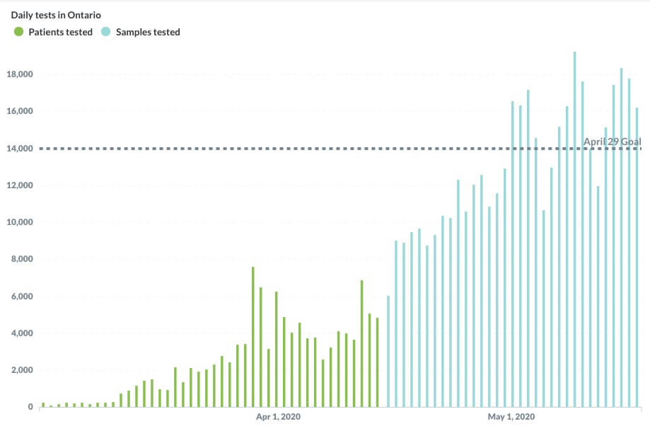
We need to consider what the primary message of the image is. Graphs and charts are a great example of this. They have a huge volume of information, but to try and capture each data point would result in a volume of text that most users not only don't need, but would negatively affect their experience.
Instead, we think about what the 'message' of the data is.
<img src="/images/testing.jpg"
    alt="A graph showing COVID-19 testing
    in Ontario, having exceeded
    the April 29 goal of 14,000 per day." >
Things people get wrong about the alt attribute:
- It's an attribute, not a tag (tags are the opening and closing of an element, but the term 'tag' is often used to refer to elements).
- It is not interchangeable with the
titleattribute. Title attributes are rudimentary tooltips that the HTML spec actually discourages you from using Opens in a new tab specifically because it's not accessible. A lot of people are under the mistaken impression that it is an accessibility requirement. It's the opposite of that. - All images should have alternative text.
- Not all images need alt attributes.
No alternative
Let's talk about those last two points.
- All images must have an alt tag. This is so everyone (i.e. the user, your team, Google's web crawler) knows if it's empty, that's on purpose.
- Some images should have empty alt attributes because the image has no meaning.

When I was a young web developer, we used images for pretty much any kind of decorative layout. Things like border-radius weren't supported in older browsers, so we rounded corners using images.
This image, if used for decoration, should have an alt attribute, and it should be empty.
<img src="rounded-box.png" alt="">The goal of accessibility is to provide all people with the same information (in addition to the same functionality). If an image provides no (or redundant) information, then there doesn't need to be alternative text for that image.
What do I mean by redundant? The World Wide Web Consortium provides us with a very handy decision-tree about what to include in your alt text Opens in a new window.
If you read through this (and it's a great thing to bookmark), you'll notice that most images don't need alternative text, provided that the meaning is conveyed in real text nearby.
I should address that the definition of "decorative" in the specification is a bit vague, and the subject of some debate. The Web Accessibility Initiative is very liberal in what it considers decorative Opens in a new window. Other folks, including Eric Bailey of Smashing Magazine, are very conservative Opens in a new window.
I encourage you to read more and form your own opinions!
To sum up, accessibility is making meaning available.
If your meaning is only available in one form, and that form excludes some people, then create an alternative.
Assignments
You're being assigned two things today.
The Reading (or listening!)
Step 1: Please read or listen to On Average (or both, for the full experience).
Step 2: In Blackboard, please submit to me 250-500 words on the following topic: How this article/podcast relates to the work of web development.
This is due Friday, March 10th by end of day.
The Group Project
Let's have a look at the group assignment.