Feedback, frameworks, and more reading!
Here's what we're going to learn about today:
Learnings from the usability test plans
Any assignment I receive from you is, in a way, user data. I can look at it and better understand how my users (students) are succeeding (or not) in achieving goals.
So, even though I can be pretty direct in my critiques, I hope you understand that all I'm trying to do is deliver information in an iterative release cycle.
Your audience is not qualified.
One misconception I often see is discussion of how "qualified" your test participants are.
But your users aren't qualified.
When I'm teaching, I have to be aware that I'm meant to be teaching everyone, not just the people who are keen on the subject and are eager to talk to me about it.
I think it's important to run a class that's as good for people who have minimal time to invest as it for people who have the ability to put in the time. Which is not to say I want people putting in different levels of effort to get the same grade. Of course not - I still want to reward excellence. But I hope to run classes where someone can quickly skim the notes the night before a big assignment after they've put the kids to sleep, and understand the absolute basics.
User testing is not about finding the best, most qualified test participants. It is about finding test participants who act and think like your audience will act and think. The basic features of your website should be easy for everyone.
Additionally, you should not be aspiring to find users who are all different from one another in every way. A sample size Opens in a new window of one user makes your data questionable. You've learned something about that person, but only by increasing our sample size can we learn things about people.
Which leads me to my next point:
When you 'assume', you make errors you can't see.
The most pesky error I saw in the test plans was a misunderstanding about the purpose of user testing.
Some of you (not most of you, but several of you), created a test plan where your testers would "divide and conquer" - testing different parts of the website, or testing for things like database integrity, or form validation.
Usability testing is not for errors that your team can recognize.
The purpose of usability testing is to test your assumptions and discover the unexpected.
Your audience are real human beings, and they will not behave the way you want them to. Your job is to build things based on their needs & capabilities, not what you hope are their needs & capabilities.
A few more things that I saw that could be improved with some usability principles applied:
Visibility of system status
“You Are Here”
- Draw a clear line between each question (what do you want to know?), each method (how will you know it?), and each metrics (how will you measure it?)
Match between system and the real world
- Some documents tried to sound more professional by complicating things. That doesn't work. Professional writing uses specialized language for the sole purpose of being very precise about complicated subjects - thus simplifying the process of understanding.
Consistency and standards
- I provided requirements for your testing. If you're not sure what they are, I suggest you look it up.
- A heuristic is not a method, it's just a good idea.
- Heuristic evaluations are a particular type of test, and that test is not a user test.
- Don't rate a binary question on a scale from 1-5.
- There is not standard System Usability Scale.
Error prevention
- Test scripts - use them, and particularly use them for describing goals/scenarios to your users.
- Don't allow more environmental variables than necessary, i.e. make an effort to limit the number of different browsers users perform the test on. The more complicating factors, the more you can't be sure about the conclusions you draw from your data.
Flexibility and efficiency of use
The Executive Summary should be an 'accelerator'. I should be able to understand the feasibility of your test plan from reading that one paragraph. If it is not an accelerator, omit it. Also, (and for that reason), you should put it at the beginning.
Aesthetic and minimalist design
More to that point, for every test plan that omitted important information, there was a test plan that included information that wasn't necessary. Don't provide paragraphs of information that could apply to any user test.
Help users recognize, diagnose, and recover from errors
A lot of people wanted to count the number of critical errors in an unmoderated test. The maximum number of errors in an unmoderated test is one. Please be there to help your users out!
Documentation
Many test plans said they would use "subjective measures", without explaining what those measures were. Imagine reading a recipe that said "take a measurement of ingredients and put it in the oven for an amount of time". That would not be a recipe you'd trust!
Finally, the most important part of a plan is demonstrating why it will succeed. I think perhaps the most common metric was "time on task". But very few people said why that would produce actionable results. As we discussed, sometimes users take a long time to complete a task because they're enjoying the experience.
Final project - good luck!
You're going to do great. All you're doing is reporting on the results of the test you planned, exactly as we discussed in Week 3 Opens in a new window. Let's look at the rubric to remember our priorities going in to this...
| Criteria | Presentation | Written |
|---|---|---|
| Speaking to the goals | 5 | 10 |
| Talking about the methods | 5 | 10 |
| Walking through the results | 10 | 5 |
| Strong conclusions | 10 | 10 |
| Reasonable recommendations | 10 | 5 |
| Documentation | N/A | 20 |
| Total | 40% | 60% |
Your presentation should run no more than 5 minutes (time yourself ahead of time to be sure!)
I'll be asking you to present in class. Any and all supporting documentation, including your written materials and screen recordings will be uploaded to, or a link supplied in, Blackboard.
A slide presentation is acceptable, as is a longform document that you talk us through. Either way though, your report needs to present what you did, why you did it, what the results are, and what your recommendations are based on those results. You must also have data that backs up your conclusions (although you don't necessarily need to talk through every single data point, as that would be pretty boring).
Bonus points
I will be awarding up to 3 bonus points per person. These will be added to your final assignment mark. They will be awarded based on you asking good questions of your classmates.
Hooray for linting!
Run this command in your terminal:
git clone git@github.com:simonborer/a11y-linting.gitWe will be looking at the command-line versions of an html validator (htmllint) Opens in a new window, a link checker (custom made with JSDom) and our auditing tool (axe).
- Open the project in your text editor
- Look at package.json under "devDependencies"
- In the terminal,
cdto the project folder - Run the command
npm install

"Photo shared by Simon Borer on October 31, 2022. May be an image of 1 person, child and indoor." Actually it's an adult, outdoors on a porch.Why you can't (entirely) lint for accessibility
As we've seen throughout our studies, accessibility is about communicating intention: What is the meaning of a picture? How is a user supposed to interact with a component?
If these meanings were programmatically discernable, the assistive technology would figure it out for us. A script can check for the existence of an alt tag, but not whether the alt tag is accurate.
As web developers, your job is to ensure that meaning reaches the user.
Your job is not to write code - it is to solve problems
In the past, we contrasted accessibility with usability by saying that usability is accessibility for a set audience, but accessibility legislation still limits that audience by defining it. You should always be open to expanding your definition of the end user.
Youtube stumbled on an audience
A few years back, the Youtube dev team Opens in a new window gave themselves a page-weight budget for their landing page of 100kb - a reduction of about 1100%. They optimized every conceivable aspect of the site. The goal was to drastically reduce the loading time of the site for the average user. When they released their new, lightning fast code, their average load times... went up. The page was loading slower on average, despite being a tiny fraction of the previous size.
There were millions of users in remote, poor, or otherwise internet-starved places who suddenly were able to watch videos without the page timing out. In underserved regions of Southeast Asia, South America, Africa, and Siberia, the page was now taking 2 minutes to load instead of twenty. The team had stumbled onto a massive audience they didn't know they had simply by taking best practices seriously.
Do what you can for those you're aware of, and keep looking for those you aren't.
Users at cross-purposes
I’m dyslexic, and one of the recommendations for reducing visual stress that I’ve found tremendously helpful is low contrast between text and background color. This, though, often means failing to meet accessibility requirements for people who are visually impaired... Consider:Eleanor Ratliff, Accessibility Whack-A-Mole
- Designing for one-handed mobile use raises problems because right-handedness is the default — but 10 percent of the population is left handed.
- Giving users a magnified detailed view on hover can create a mobile hover trap that obscures other content.
- Links must use something other than color to denote their “linkyness.” Underlines are used most often and are easily understood, but they can interfere with descenders and make it harder for people to recognize word shapes.
Remediation
Before you begin testing, it's important to set expectations. tooltester.com Opens in a new window reported their results of automated accessibility testing on the top 200 websites. These are their top 3 most accessible websites:
| Site | Total assets | Errors | Warnings | % of site inaccessible |
|---|---|---|---|---|
| Nih.Gov Opens in a new window | 555 | 1 | 76 | 0.18% |
| Cdc.gov Opens in a new window | 543 | 1 | 59 | 0.18% |
| Gov.uk Opens in a new window | 492 | 1 | 14 | 0.20% |
Accessibility, particularly achieving full WCAG Level AAA compliance, is a lofty goal. It seems as though there is no site of appreciable size that is 100% compliant. The goal should be to catch issues & interpret the warnings, understand the impact, and triage appropriately, while planning to avoid these issues in the future.
That being said, let me share with you two test plans - one as an MVP, and one describing my own process.
A minimum viable test plan
- Perform all your standard tests to make sure your code is working properly - unit tests, HTML & CSS validation, etc.
- Use the browser tools to expose the "accessibility tree" - the structure and information made available to assistive technologies.
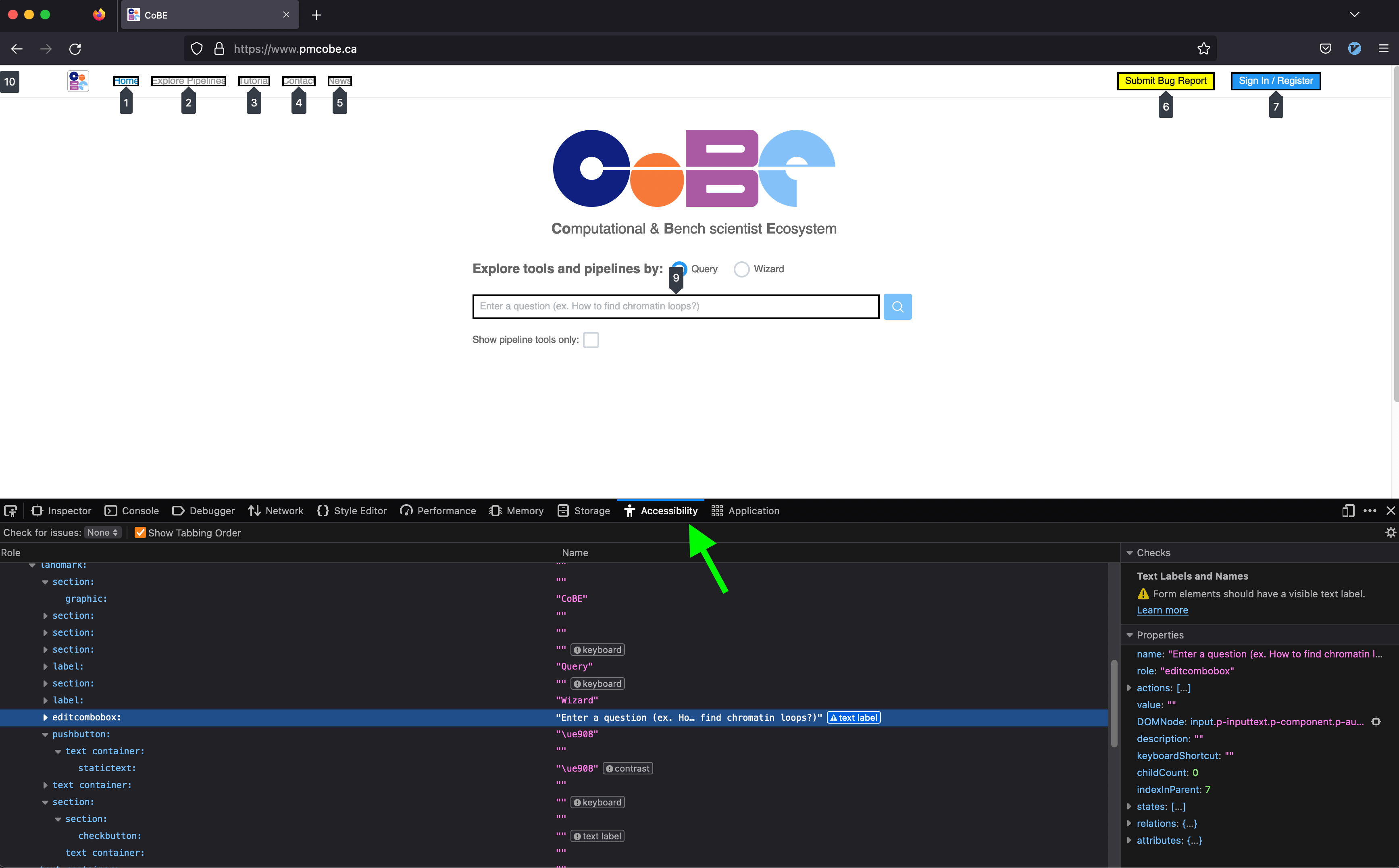
- Use the browser tools to expose the "accessibility tree" - the structure and information made available to assistive technologies.
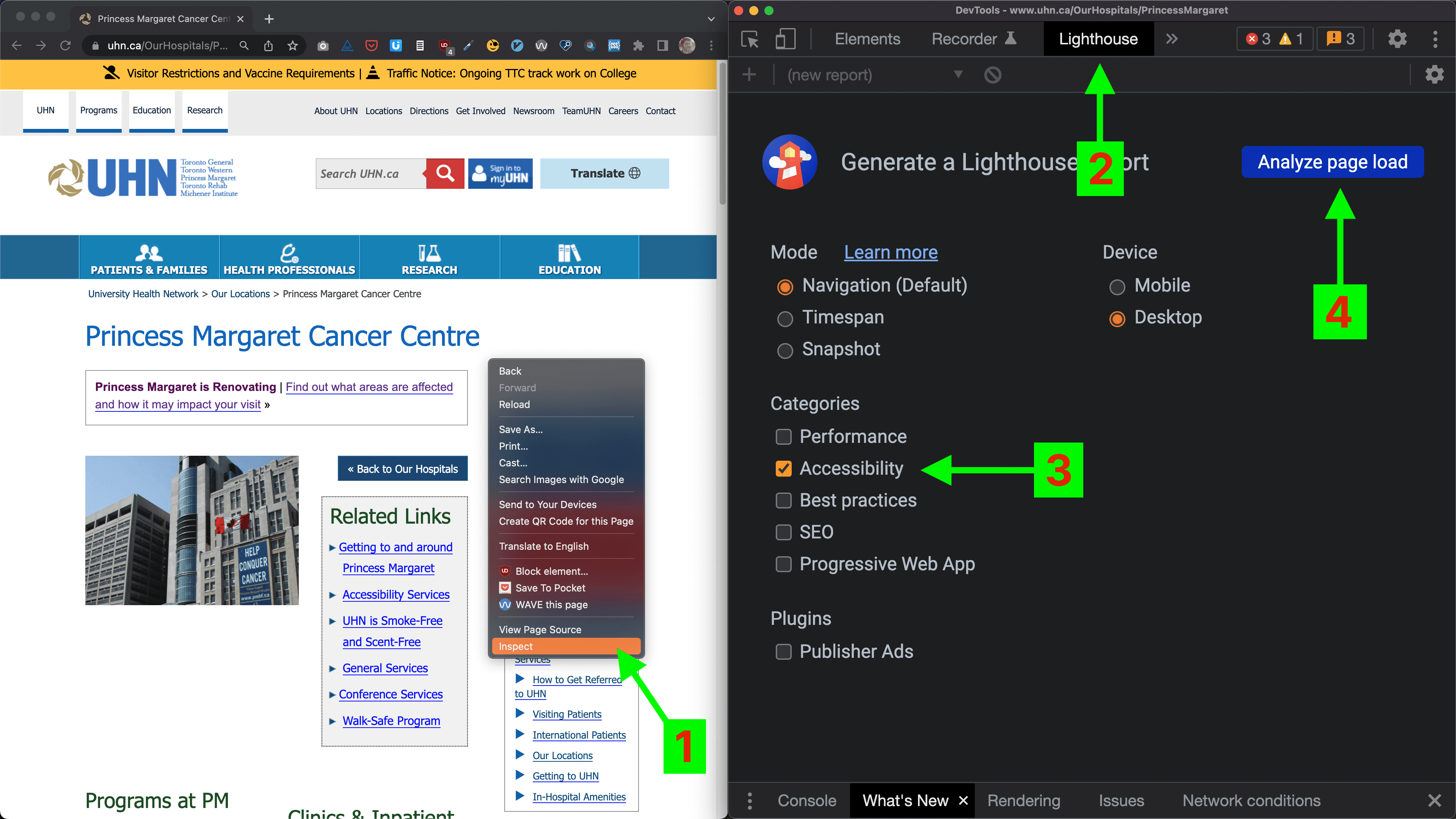
- Use Lighthouse
-
- Right-click anywhere on the page and choose "Inspect" to bring up the developers' tools.
- In the dev tools menu bar, choose "Lighthouse", and select an accessibility audit.
- Using Microsoft's Accessibility Insights for Web browser extension Opens in a new window, perform a guided manual test.
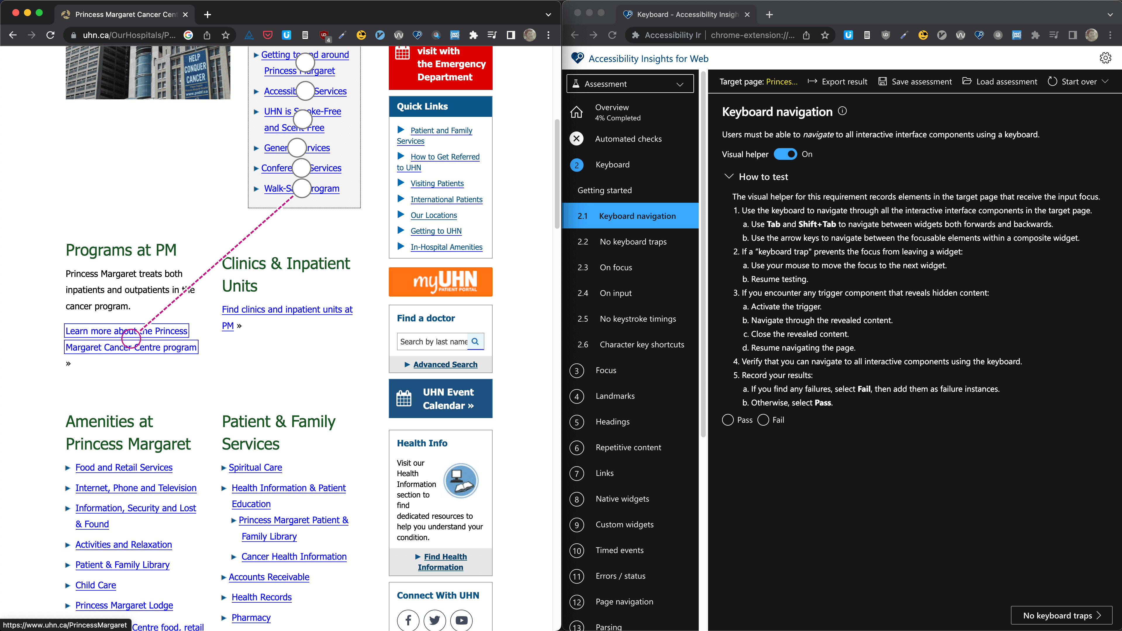
Accessibility Insights for Web guides you through the steps of a manual audit, with instructions and live visual aids.
Using these two tools will catch the a large majority of accessibility issues. They both provide results that are exportable as JSON, meaning you can easily triage and incorporate the issues into your bug-tracking system, tracking progress over time.
- Learn to use a screen reader.
The ideal way to supplement these two tools is by testing with the actual user interface under test.
I developed responsive websites for years using the dev tools' mobile emulators, and that was usually good enough, but about once a month the QA team would find a bug while using a real mobile device that wasn't represented in the emulators. Learning to use a screen reader fluently can take some time, but once it becomes a part of your experience, you will absolutely start building better applications.
A comprehensive test strategy
When I perform a site or content audit, I follow a similar process, but with a few more tools to help with the volume of content involved in a full site audit.
If you are planning to tackle a significant backlog of content, you may want to consider a process that has a longer set-up time, but can multi-task much more efficiently.
Automation
- Get a list of all the URLs you'll be auditing. If someone can provide full list/sitemap, that's great, but it's nice to run a Python script that returns all the pages, just to be sure.
Looping through each one of the pages in a headless browser…
- ↻ Validate the HTML Opens in a new window
- ↻ Perform an automated accessibility check with the axe-core library Opens in a new window (the foundation of Lighthouse and many other accessibility checkers Opens in a new window).
Manual testing
Provided there is sufficient resources for it, I'd opt to perform these tests site-wide, however at minimum each one of these tests should be performed on one instance of every page template and interactive component.
- Guided manual testing with AIW Opens in a new window.
- Manual screen reader/keyboard-only usability testing.
Reporting
- Compile results in JSON from steps 2-4, and convert to CSV (spreadsheet) format.
- Incorporate notes from usability testing.
- Categorize based on severity, frequency and ease of resolution.
Accessibility in Front-end JS Frameworks
Today we're going to look at the big three Opens in a new window.
| Vue | ES5-compliant browsers - IE9+ (if configured properly) |
| React | ES5-compliant browsers - IE9 and IE10 require polyfills |
| Angular | Modern browsers. Safari 7 & 8, IE9 to IE11, older Android require polyfills. |
What are you using your framework for?
Is it as a static site generator? Cool. Render on the server. Serving static HTML is waaaay faster.
Let's assume...
Let's assume you've got your fallbacks and polyfills in place. Let's assume SSR isn't an option. How do we make Vue, React and Angular accessible?
You have most of the tools necessary already:
- Update page titles when appropriate
aria-liveregions for content updates- Focus management when navigating
Accessibility in Angular
- Codelyzer Opens in a new window for monitoring angular's a11y "traps"
liveAnnouncerfor content updates, along with other accessibility tools Opens in a new window in the Angular code development kit.
Accessibility in React
React is a lot more on top of accessibility.
React, first of all, has a pretty mature routing ecosystem with accessibility largely factored in.
Aria attributes are supported in JSX (but note that they're lowercased instead of camelcased Opens in a new window like most other attributes), and the `for` attribute, used with labels, is written as `htmlFor Opens in a new window` in JSX.
The best approach to take is to integrate aXe's auditing library in react Opens in a new window.
Accessibility in Vue
Vue doesn't have any Opens in a new window has accessibility documentation... still finally!
Emily Mears has written a pretty great article Opens in a new window about accessibility in Vue. The main challenges are held in common with React - updating meta, handling focus and implementing aria.
Whereas Vue has been the "new kid on the block" framework for a few years now, it tends to be a follower when it comes to accessibility. It has an announcer Opens in a new window like Angular, and aXe-based auditing Opens in a new window like React, but neither as well-implemented or mature as the older framework.
One thing it does have going for it is an active accessibility community Opens in a new window.
Further reading
Well, naturally, there's the documentation:
...and then there's the world-class organization:
...then there's the people in your own backyard:
...there's also the certification:
- International Association of Accessibility Professionals Web Accessibility Specialist certification Opens in a new window
...then there's a very short list of the very many people you should follow:
- Tatiana Mac Opens in a new window (my personal favourite - a real accessibility spitfire)
- Anna E. Cook Opens in a new window
- Zoë Bijl Opens in a new window
- Natalie Patrice Tucker Opens in a new window
...and then there's a list of blogs and projects that are nice to keep tabs on:
- The Accessibility Project Opens in a new window
- Inclusive Components Opens in a new window
- A11y Collective Opens in a new window
- A11y & Me Opens in a new window (and the newsletter A11y Weekly Opens in a new window)
- A11y Coffee Opens in a new window
- A11y-101 Opens in a new window
- Digital A11y Opens in a new window