What to do with your data: collecting, compiling, analysing, reporting and presenting. We'll also learn how to use a screen reader.
Table of Contents
Last week we looked at how to:
- ask good questions that give us reliable data,
- vet those questions for bias (peer review), and
- script those questions (and/or the language that frames them) in order to keep our data consistent, and avoid leading the subject.
Today we're going to talk about the 5-step process that's going to get you to the finish line (aka your final report):
- collecting our data
- compiling our data
- analysing our data
- reporting our data
- presenting our data

Data collection
Data collection is the step that takes place during the execution of the test.
 Since you've already defined, in your test plan, the "whys", the "hows" and the "what types" of data you're collecting, the actual process of collecting data should be fairly straightforward.
Most likely, you'll be doing some combination of the following:
- Taking notes (or having a partner take notes),
- Screen/video recording,
- Tracking in Excel/Google Sheets/Airtable/some kind of git-based csv workflow.
Of course, you're allowed to have an assistant helping you track (or heck, as many assistants as you'd like), but it's unlikely that you'll encounter the kind of messiness that comes from working as part of a larger team.
That being said, you should have a plan for your data collection workflow. (Note: this might be a nice thing to include in your test plan)
A workflow plan for a small project can be quite simple.
For example…
- Screen recordings backed up to Dropbox
- Observations in spreadsheet for each participant:
- 1 tab per goal
- 2 columns per task
- 1st column / task - errors are entered in rows with colour coding for severity
- 2nd column / task - timestamp
- SUS as Google Form
…or whatever is appropriate for the type of data you are collecting.
Point is, it's a really good idea to define where the data's going to go, and how you'll keep it organized, before it's time to compile it.

Data compilation
Data compilation is the step wherein you prepare your data for analysis.
 For those of you who are working exclusively quantitative data, this will be sort of a mini-step. You may write some Excel formulae in advance, fill out your spreadsheet during testing and be done with it.
When dealing with qualitative data, however, you'll need to decide (preferrably ahead of time), how you're going to compile your data.
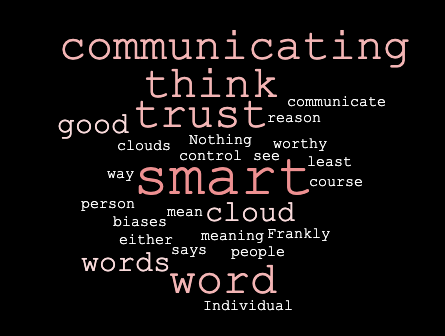
One example of compiling qualitative data is a word cloud. Personally, I happen think word clouds are a stupid way to present data. They look "cool" (do they though?), but don't actually show you word frequency in a way that's easy to parse (as the words are usually fairly close in size), so people's brains will pick up on the words that confirm their biases (which is why people like word clouds, really).
Since you're dealing with a small sample size, you could simply present individual answers, and that can be valuable, but only when that single data point is significant.
Single data points are significant when that individual teaches us something about a larger issue.
For example: "One participant took 20 seconds longer than others to fill out this form. When we asked them why, they said their cat walked across their keyboard." Not significant.
A different example: "One participant was confused by the error message. They recently immigrated from China, where the colour red does not definitively signify an error, and the content of the error message didn't actually explicitly say it was an error message."

While this participant might be the only one of the 5 participants that was confused by this, the reason they were confused raises a potentially significant usability problem for a lot of people.
The inverse is true as well - aggregate data is only as important as the lessons we take away from it.
When compiling your data, don't pass judgement by ignoring potentially significant data (individual or aggregate) until you've analysed and determined its validity.

Data analysis
Data analysis is the step where you find out the answers to your questions (and make new discoveries!)
Just like in the compilation stage, the complexity of this step is defined by the kind of data you're dealing with, and the kinds of questions you asked.
If you already have a tightly defined hypothesis (i.e. "If users can complete the 'checkout' task in < 120 seconds with no critical errors, the 'checkout' task does not require a redesign"), and you're dealing with quantitive data, analysing those results will be fairly simple.
Are users regularly able to complete the 'checkout' task in under 120 seconds?
Users averaged completion of the 'checkout' task in 96 seconds. The minimum completion time was 88 seconds. The maximum time was 104 seconds. No critical errors were observed. We can conclude that the 'checkout' task does not require a redesign.
If you have a more loosely defined hypothesis (i.e. "Users may find alternate ways of completing the checkout process"), this step may be more labourious.
The amount of work you have to do in this stage isn't a sign of success or failure, it's a function of your methods and data types.
Facts vs. Conclusions vs. Speculation
In the compilation phase, you are able to generate facts.
Facts are not valuable in and of themselves. In the analysis phase, you must turn facts into answers.
Again, this is not a group project, but I strongly encourage you to have a partner challenge your conclusions.
A fact that doesn't answer a question is not important.
A conclusion supported by facts is important.
Speculation is also important, so long as it is presented as a line of further inquiry, and not a conclusion!
Consider the following fact (via Nature.com Opens in a new window):
Fact: Sixty years ago, 10–20% of the Chinese population was short-sighted.
Without a relevant question, this fact doesn't matter much.
Let's add context (more facts) to raise a question.
Fact: Today, up to 90% of teenagers and young adults in China are short-sighted.
Ok, now things are getting interesting. We see a change over time, which leads us to believe that something is having an impact. We can speculate - higher rates of diagnosis? More reading/detail-oriented work?
Fact: At a school in southern Taiwan, teachers were asked to send children outside for 80 minutes of their daily break time instead of giving them the choice to stay inside. After one year, doctors had diagnosed myopia in 8% of the children, compared with 18% at a nearby school.
Those of you with a scientific background will know that this isn't a large or well-controlled enough study to draw strong scientific conclusions from, and doesn't rule out other factors contributing to myopia, but it does suggest a statistically-significant connection.
For the purposes of usability testing, we are looking for strong connections (not necessarily conclusive evidence).
P-hacking
As a little aside, let's look at a common pattern of abusing statistical significance: 'p-hacking'.
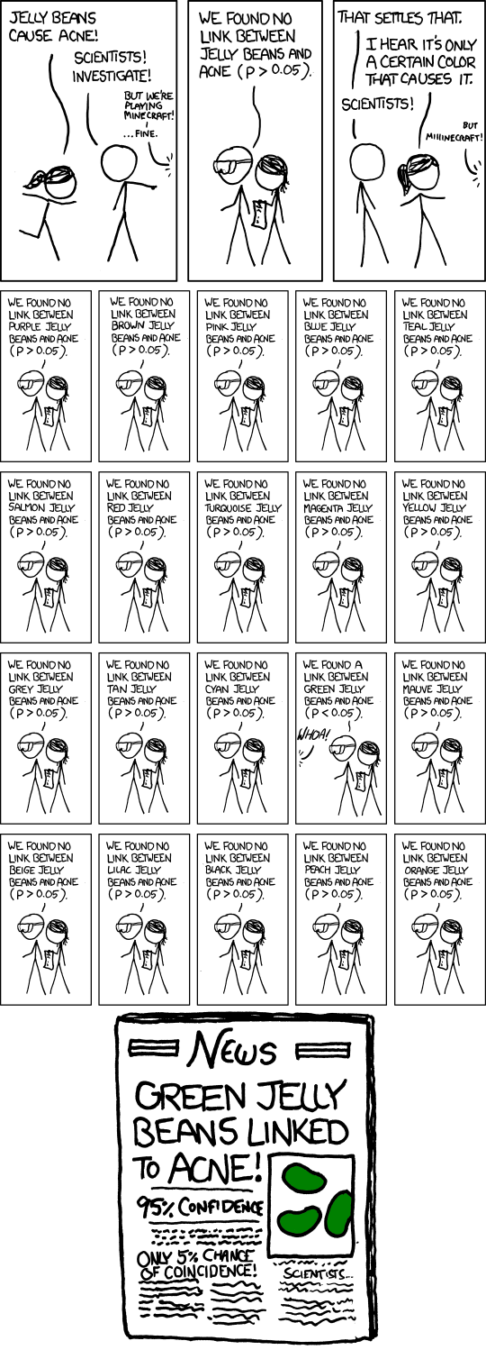
P-hacking is the manipulation of data's 'p-value', a.k.a. the likelihood of data being coincidental.
Let's take a look at 538's wonderful p-hacking interactive tutorial Opens in a new window.
As we said, some of your data analysis will be simply testing a hypothesis - taking your assumptions and seeing if they are correct.
There is also analysis that discovers new ideas - answering questions you didn't think to ask in the first place, but are valuable nonetheless.
One type of "post hoc" (after the fact) analysis - generating new ideas after the collection of the data - is "task analysis".
Task analysis
When you provide users with scenarios (a.k.a goals), you'll probably want to break down those goals into the steps they would take to accomplish those goals.
What users actually do is another story. By looking at the tasks users actually perform, you can gain valuable insights into how users use your web site.
Task analysis topics
- Trigger: What prompts users to start their task?
- Desired Outcome: How will users know when the task is complete?
- Base Knowledge: What will the users be expected to know when starting the task?
- Required Knowledge: What the users actually need to know in order to complete the task?
- Artifacts: What tools or information do the users make use of during the course of the task?
Data analysis is a complicated topic, and it depends largely on what questions your trying to answer, what topics you're trying to investigate, and what type of data you're working with.
The best advice I can give you is to find some people who will challenge you.

Reporting your data
Proposing solutions
 Now that you've understood your data, it's time to generate some solutions.
This is the point. This is why you get paid the big bucks.
A usability report is, at its best, a plan for action. There are two types of 'takeaway's:
- things to improve, and
- things to investigate further.
How to tell people how they can improve
Keep solutions specific and positive - 'don't use hamburger menus' is not an action, it's a non-action.
The gold standard is 'elegance', which is just a fancy way of saying 'cheap, fast, easy and effective'.
Most solutions won't be elegant though. It's up to you to be mindful of how resource-heavy your solutions are - and how certain you are of their efficacy.
The more uncertain you are of a solution, the more you'll need to be prepared to present multiple options, and to speak to the pros and cons of each one.
Consider laying out your solutions in a chart graded for issue severity and actionability.
A basic structure for your report
- What we did
- Why we did it
- How we did it
- What we learned
- What should be done
- All the boring data that backs this up
Another possible format:
Via UX Design Templates Opens in a new window
- Cover sheet
- Test outline
- Test participant details
- Executive summary
- Bugs list
- Sheets for key findings (including usability problems and positives)
- Post-test question responses
- Full list of recordings
Be useful
When writing your report, remember that you are trying to make life easier for people who are trying to make their website more usable.
- Be specific
- It's not the user's fault
- Don't recommend making small changes to a big problem
- Don't do their redesign for them
- Align with the client's priorities
- Help the client prioritize
Make it readable
Hey, what's up, so, ok - you can be, like, totally informal in your writing, ok?

Being informal doesn't mean being lazy. It's actually more difficult - you need to explain thoroughly, but in simple terms, and in a way that's easy to synthesize.
You're telling people how best to spend their money. Focus on what they care about - what works, quick wins, and big wins.
That said, if you want a jumping-off point for a more formal documentation format, here's some examples:

Data presenting
Now that your report is ready, you'll need to give a sort of 'executive summary' as a 5-minute presentation. My advice: start with the conclusions and work backwards.
Presenting a story
The point of all this is to give people something they can use. Data is boring. If your report puts them to sleep, they won't use it. Anecdotes are fun, but lack credibility. People won't use your report if they don't feel they can trust it.
Use enough data to build a credible story, but focus on appealing to the things that people really pay attention to - actions that create value.
Be funny. Be informal. Think of your report as having a beginning, middle, and end Opens in a new window. Tell the story of the website, the testing, the results, and the solutions. And yes, even the data.
The best way to do this is to focus on people. Talk about yourself, the participants, the website's audience, the client. That's the only real way to help us all figure out why the data matters.

Using a screenreader
Alright, as discussed last week, if you're working with a group of users who are not your classmates, they need to use only the keyboard, no mouse.
If you're working with a group of users who are your classmates, they will need to use only a screenreader (no monitor!) to accomplish their goals
What is it?
A screenreader is a software program that takes computer interfaces (including browsers and websites), and speaks them out loud.
If you're using a screenreader, you don't need to see your computer to use it!
Which screenreader should I use?
There's lots of screenreaders out there! You've got a few already available to, in all likelihood.
Default screenreaders
- Windows 10
- Narrator Opens in a new window
- Mac OSX + iOS
- VoiceOver Opens in a new window
Popular screenreaders
The most popular screenreaders aren't the defaults, though. Almost 85% of screenreader users use one of the following:
In the most recent WebAIM survey Opens in a new window JAWS (the long-time front-runner) took back the top spot from NVDA. This is kind of not cool, because NVDA is free (which is about $1000 cheaper than JAWS).
Using a screenreader
For our purposes, use the screenreader that's most easily available to you - your built-in option is fine, but if you're on Windows and want to use NVDA, that's cool too.
Rather than write out individual instructions for each screenreader, I'll tell you this:
Most screenreaders have built-in tutorials. Complete the tutorial for your preferred screenreader, or at least go as far as you'd need to navigate a web page.
If you'd like to understand some concepts before you jump in, this article is a good walkthrough about screenreaders - Opens in a new window of what you can expect.
Screenreaders can be really annoying to begin with - it's a flood of information in a way you're not familiar with yet. It gets easier.
Component of the Week
See the Pen Accessible toggle by Simon Borer (@simonborer) on CodePen.
The most complex concept when creating accessible content is communicating a change of state.
State changes are most often apparent because of visual cues.
In the above example, we have a toggle switch. In some cases, a toggle switch should just be a radio button (which, as a native form element, is inherently accessible). However, a 'toggle' can sometimes better communicate the idea of submitting a default binary value, rather than choosing one from a group of values.
Toggles are not inherently accessible, because they are not native HTML elements - so we have to communicate their purpose, and not just visually.
Luckily, ARIA recognizes that they are a common feature, so we have a role value available:
<button role="switch">With this role, we can pass the aria-checked true and false values to indicate whether it's 'on' or 'off'.
We change these values with JavaScript.
We're also able to tightly couple our styles with the attributes that make this switch accessible - meaning we make accessibility mandatory.
One more important thing to note is the aria-labelledby attribute - meaning that anyone landing on our toggle (for example, by tabbing to it) will know what it's for, without having to backtrack.